This Ideabook is for art lovers. Artists get into a real tizzy about the subject of people looking for art-to-match-the-sofa. Coming from a background as an artist, I always encourage my interior design clients to select art first if they don’t have any so they feel free to buy what they love and not worry about what it goes with. And then we can plan the decor around the art.
I’m sure I’ll get an irate artist or two commenting here. I’ve spoken with some artists who feel the art completely stands on its own and should have nothing to do with the decor. Here’s the simple fact. No matter how irritated artists get by the subject of art-matching-the-sofa, your art will always look better and have greater impact in the space when the decor supports the art. Here are techniques you can use in your decor to support your art and make it even better.
I’m sure I’ll get an irate artist or two commenting here. I’ve spoken with some artists who feel the art completely stands on its own and should have nothing to do with the decor. Here’s the simple fact. No matter how irritated artists get by the subject of art-matching-the-sofa, your art will always look better and have greater impact in the space when the decor supports the art. Here are techniques you can use in your decor to support your art and make it even better.
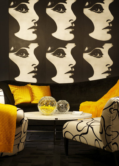
1. Repetition of color and line. This art is so well supported by this room. The strong black-and-white graphic image is echoed in the black-and-white upholstery with lines that are similar to the curves in the woman’s face. Even with the bright yellow accents in the room, the art is still the standout.
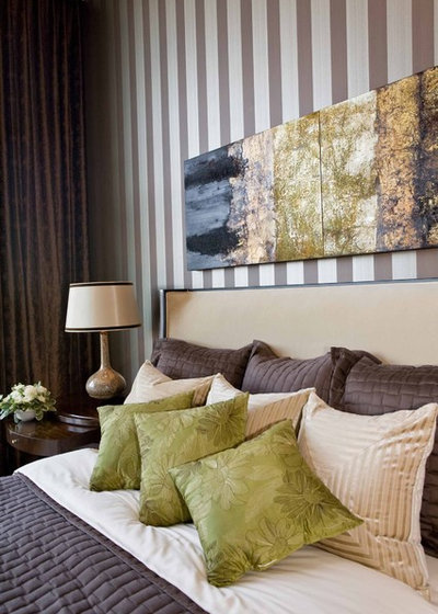
Repeating color from the art increases its impact in the room. Here, the green bed pillows pull their color from the art. Without them, the art doesn't feel quite as strong. Try it! Put your finger just over the pillows in the picture. Having that bit of green on the bed to echo the color visually strengthens the art.
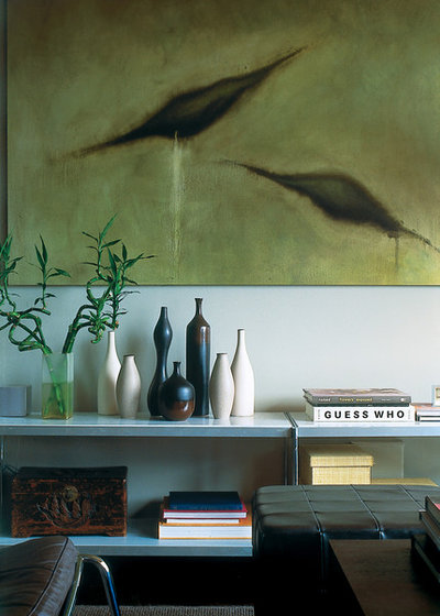
The undulating lines of the vases on this table pick up the shapes from the painting and increases its visual interest.
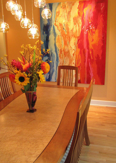
There are a lot of ways to repeat the lines in art. This dining table emulates the curves and the color of the center of the painting. The floral display brings in more of the color.
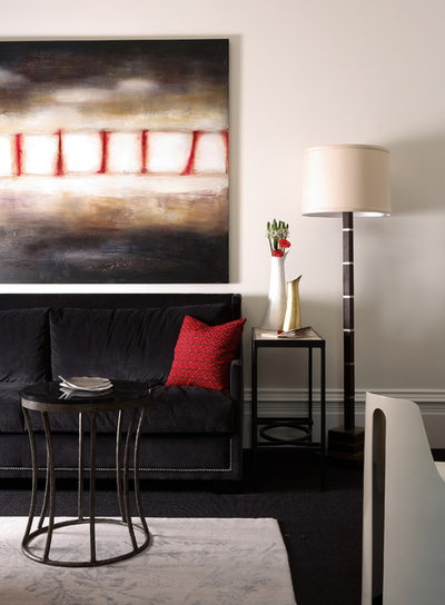
2. Balance of color. This art has a lot of black with just a little bit of red. The black sofa with just a little red pillow keeps the same balance of colors as the art. Carrying that balance of color though the furnishings spreads the influence of the painting.
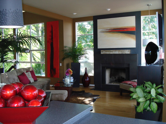
3. Multiple works of art. Combining multiple works of art by the same artist or that have a very similar style creates greater impact. Here the art above the fireplace and the red painting on the wall work together to contrast their strong horizontal and vertical lines, balancing each other and drawing your eye first to one, then the other, and back again. Together they create a stronger look than each would have by itself.
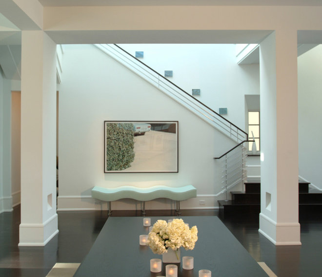
4. Furniture placement. Placement of your art is important, but so is the placement of your other furnishings around the art. This painting would have looked great on the wall all by itself. But the wavy bench underlines the painting and gives it emphasis, the same as underlining a word in a sentence.
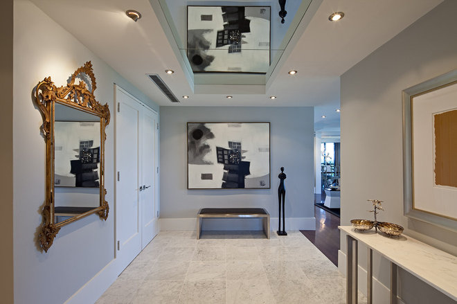
5. Reflection. Through the placement of mirrors on the wall and ceiling, walking down the hall you get this painting repeated in reverse and upside down. It’s a pretty dramatic way to get you noticing the reflections then studying the painting to see how it looks when it isn’t turned upside down and backwards.
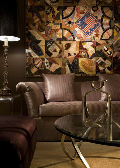
6. Restraint: Sometimes you can support art by just exercising some restraint and letting it be the star of the room. The quilt behind this sofa is extremely detailed and really invites inspection. By keeping the sofa, chair, wall color, lampshade and rug in a monochromatic scheme, the designer gives your eye someplace to rest. In this case, because of the level of detail in the art, picking up colors and shapes in accessories would actually distract.
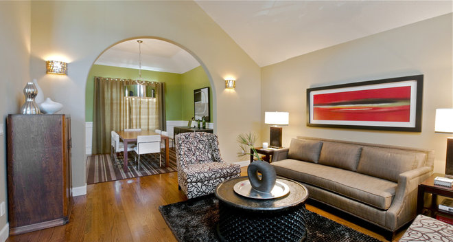
The green slash of color in the painting is only repeated in the wall of the dining room visible through the arch … and nowhere else. It has more impact than it would if accessories all over the room picked up the color.
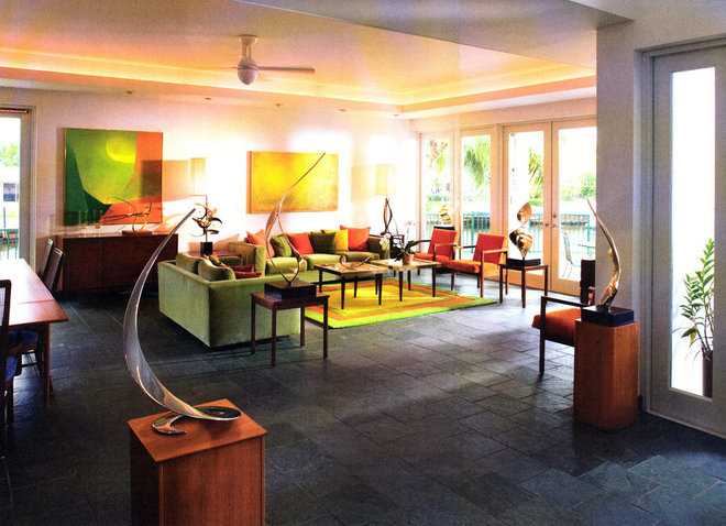
7. The color palette. Going beyond just picking up a single color from a painting, this room has used all of the colors in the art for the room’s entire color palette. This artwork is by the homeowner, so she was able to surround herself with colors that she loves. The rug seems to pick up all of the colors of the painting on the left. I wonder if it is custom or just a very lucky find?
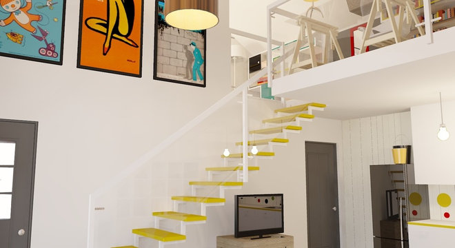
8. Style. The art above the stairs is contemporary, with clear and bright colors. The yellow open stair treads feel just as fresh as the artwork and complements it beautifully.
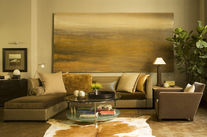
The style of the artwork is soft and serene. The style of the decor complements it beautifully with the same muted color palette and soft velvety textures.
9. Humor. I have to confess that I’ve bought plenty of art because the subject made me laugh out loud. In my own entryway I have a large portrait of my husband making a funny face. It stops first time visitors in their tracks when they see it, then gets a belly laugh, and the conversation gets off to a great start.
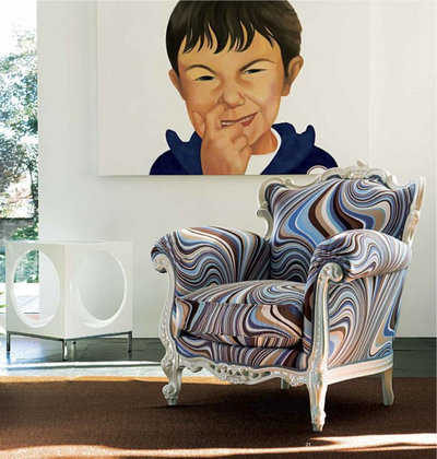
This large painting of a boy picking his nose is pretty outrageous. The chair below it is pretty outrageous too, with the wild contemporary print on a traditional chair style. Don’t be afraid to have a little fun with your art and decor. It doesn’t need to be serious all the time.
This large painting of a boy picking his nose is pretty outrageous. The chair below it is pretty outrageous too, with the wild contemporary print on a traditional chair style. Don’t be afraid to have a little fun with your art and decor. It doesn’t need to be serious all the time.
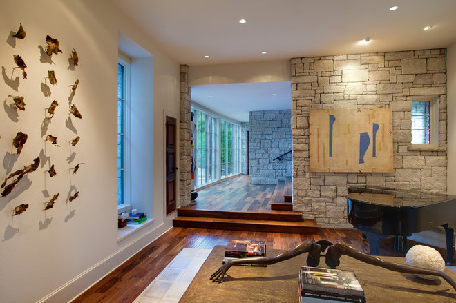
10. Lighting. Most people realize that putting a spotlight on your art will highlight it and make it stand out. But in this room the lighting increases the impact of the art by the shadows cast. Using lighting to enhance your art is another big subject, so I’ll have to go into that in another Ideabook.
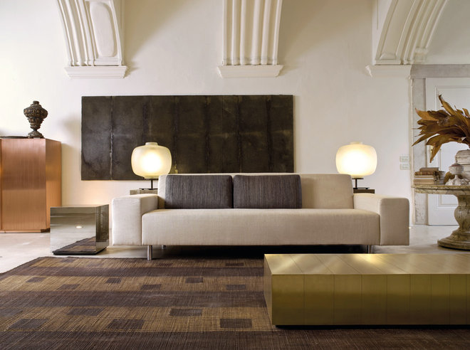
Combine techniques. Using a combination of the above techniques creates a very strong design. This room is so expertly done and supports the art so uniquely. The large black rectangle of the art is found in the shape of the pillows and again in the pattern in the rug. Notice how the art is not centered behind the sofa. That staggering of rectangles is picked up in the pattern of the rug — in the placement of the pillows to one end of the sofa — and again in the off-center placement of the coffee table. It combines repetition of color, repetition of shape, and furniture placement to add emphasis.
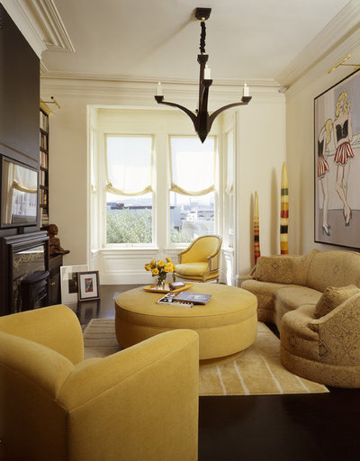
This room also employs a few techniques. The sculpture in the corner and the painting share several colors so they work beautifully together. A very subtle touch is the shape of the black chandelier repeating the curves of the women’s bustiers in the painting. Subtle, but very effective.

