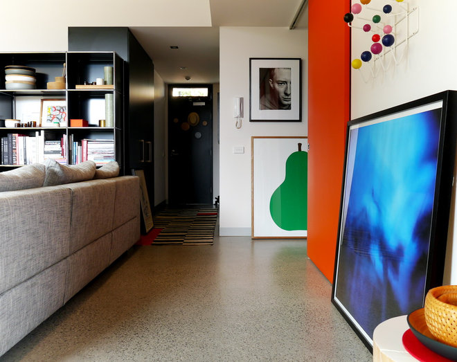
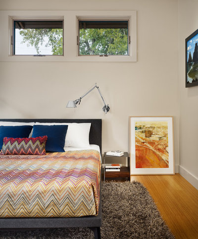
Display art at home with nary a nail or hook in sight by leaning it like you mean it
Leaning art has one obvious advantage – you don’t have to whip out the hammer and nails and/or consult your landlord to do so. But there’s more to it than that. There’s an elegant carelessness to art resting nonchalantly against the wall that is in keeping with schemes that strive for the ‘imperfect perfect’ look; schemes that don’t take themselves too seriously. In fact, when done well, leaning art not only provides a beautiful accent to a room but is also a great (and flexible) display option for a growing collection. Here are more reasons that may resonate with you, and how to lean art like a pro.
1. It suits your style
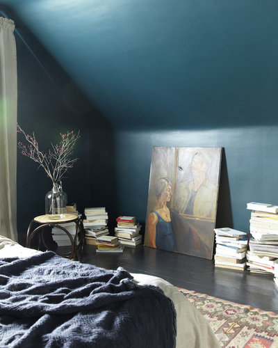
There’s something very casual and relaxed about an artwork leaned up against the wall, and that may be exactly the vibe you’re trying to channel in your home. For instance, lovers of laid-back bohemian style will enjoy this carefree print, propped up against a deep blue backdrop.
Lean it like you mean it: To make it look intentional (i.e. not like you’re just too lazy to hang it), surround your leaning artwork with stacks of books, or a vase of flowers, also sitting on the floor.
2. You’re renting …
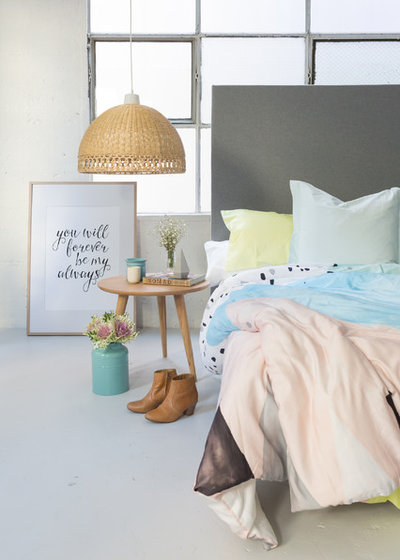
I can personally empathise with the struggle of finding a cost-friendly, and damage-free solution for livening up bare walls during a rental lease. Temporary removal hooks always help with smaller frames, but often don’t have the strength required to hold up larger pieces of art. If you want to avoid surrendering the frame in favour of the old ’tac it up’ fix, lean framed art pieces by the bedside table or in forgotten corners to create visual interest.
Lean it like you mean it: Match complementary textiles and features with each other to tie the group together in a collected an interesting vignette. Here, the colours of the timber frame match the warm, light tones of the lampshade and stool.
3. … Or you live in a share house
Shared living arrangements can limit your options for displaying your favorite pieces. Sometimes there’s limited wall space in general, sometimes your housemates’ tastes may not align, ruling out your high hopes for a communal gallery. Leaning art gives you the option to rotate artwork around the shared space (bonus points if you brainstorm new positions and pairings together) without the hassle of adjusting the wall hooks each time.
Shared living arrangements can limit your options for displaying your favorite pieces. Sometimes there’s limited wall space in general, sometimes your housemates’ tastes may not align, ruling out your high hopes for a communal gallery. Leaning art gives you the option to rotate artwork around the shared space (bonus points if you brainstorm new positions and pairings together) without the hassle of adjusting the wall hooks each time.
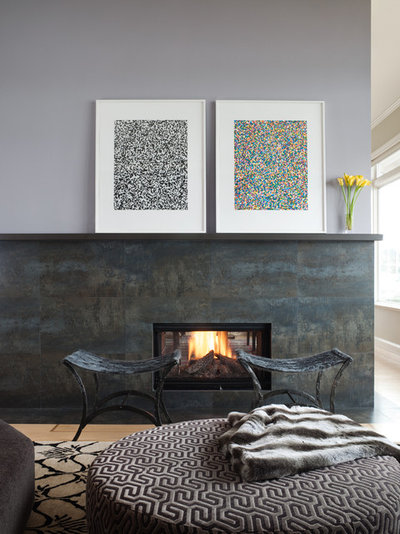
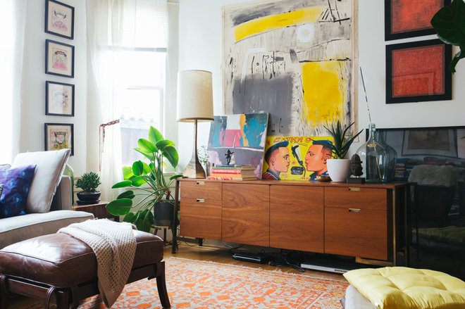
Lean it like you mean it: Match an artwork’s size to the shape of the walls around it, or the perspective lines of a room. Here, the artwork leans neatly in line with the height of the fireplace, leading the eye out through the window. The dark features in the painting also tie in with dark accents in the bottom half of the room, and so leaning the painting keeps a sense of uniformity, while still maintaining a relaxed style.
4. Your vanity needs livening up
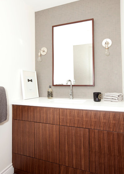
Art can liven up a plain bathroom vanity, or any bench space come to that, providing colour and height. The cute little bow print here creates subtle interest in a pared-back scheme, but don’t be afraid to go bigger and bolder.
Art can liven up a plain bathroom vanity, or any bench space come to that, providing colour and height. The cute little bow print here creates subtle interest in a pared-back scheme, but don’t be afraid to go bigger and bolder.
5. You have a standout piece and you want to show it off
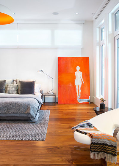
Artwork’s subjective character can often divide an audience; isn’t it great that way? Leaning an oversized colourful painting against the wall can have two great effects. Firstly, it’ll provide more flexibility for you to move it around to another prime spot if you fancy a change (more on that in a bit), and secondly, it makes the painting seem more like furnishing than wall art. Not to mention that you save yourself a paint job in the long run.
Artwork’s subjective character can often divide an audience; isn’t it great that way? Leaning an oversized colourful painting against the wall can have two great effects. Firstly, it’ll provide more flexibility for you to move it around to another prime spot if you fancy a change (more on that in a bit), and secondly, it makes the painting seem more like furnishing than wall art. Not to mention that you save yourself a paint job in the long run.
6. You have all of the artwork, and none of the space
Having too much artwork to display at once is one of the best problems you’ll experience as a homeowner. If you don’t want to limit the pieces that are on show, create a layered display. Follow the rule of thumb of one large, one medium and one small piece, to keep the space striving for balance.
Having too much artwork to display at once is one of the best problems you’ll experience as a homeowner. If you don’t want to limit the pieces that are on show, create a layered display. Follow the rule of thumb of one large, one medium and one small piece, to keep the space striving for balance.
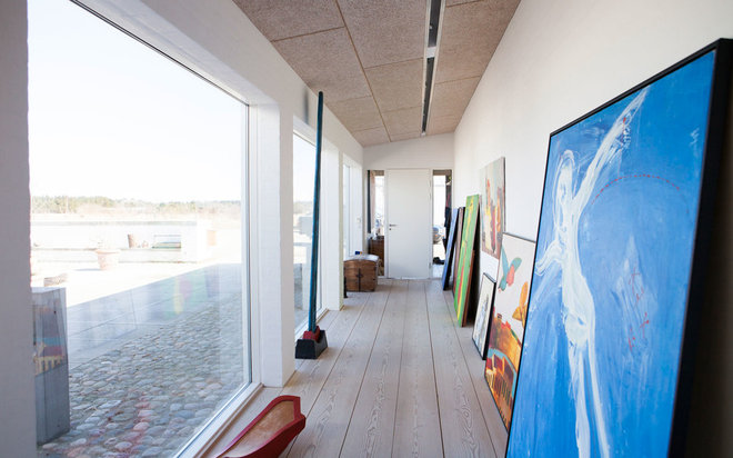
Hallways are a great place to display a bunch of your prized artworks, where you can also have fun with layering and overlapping.
Lean it like you mean it: Keep the room balanced by matching proportions – notice the top line of the highest artworks are on a level with the top line of the window and the door.
Lean it like you mean it: Keep the room balanced by matching proportions – notice the top line of the highest artworks are on a level with the top line of the window and the door.
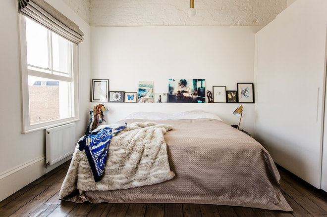
Don’t have space on the floor? Shelves or chair rails are a great alternative for leaning art on, with the added bonus that you’re adding colour and interest to the top half of your scheme.
Lean it like you mean it: Group the work in numbers, but play with size and orientation to leave a nonchalant feel, or let the artwork take its place in the room by power-coupling complementary pieces together.
Lean it like you mean it: Group the work in numbers, but play with size and orientation to leave a nonchalant feel, or let the artwork take its place in the room by power-coupling complementary pieces together.
7. You can’t choose!
In fine art photographer Serap Osman’s house, leaning artworks are the display of choice, due to her ever-growing collection of works, and no space is taken for granted. Leaning the work on the walls means all of the art is on display at once, and none of her favourite pieces miss out on the limelight.
Edward Hartley, co-founder of online art store Bluethumb, says: “If you’re a big art collector like myself, you probably have more art than wall space, so you can rotate your art depending on the time of year or the atmosphere you’re trying to create. Instead of having to remove nails and re-plaster, by simply hanging shelves you’ll give yourself the flexibility to keep growing your collection.”

